Introduction
Risk dashboards have become one of the most widely used tools across financial institutions, not just for senior management but for risk teams, analysts, operations partners, and governance functions. Dashboards translate complex exposures, trends, and risk drivers into a structured, visual format that supports informed decision-making. They consolidate information that originates from numerous systems, processes, and desks, presenting it in a format that allows users to quickly identify issues, interpret patterns, and assess the institution’s overall risk posture.
Dashboards serve different purposes depending on the risk discipline—credit, market, liquidity, operational, model, or non-financial risk. Each dashboard reflects a particular analytical lens, but all share the same core objective: enabling transparency, promoting early detection of emerging themes, and supporting well-governed escalation pathways.
This article provides an informational and educational overview of how risk dashboards support different types of risk functions. It does not describe any institution-specific methodologies or proprietary reporting structures.
How Dashboards Support Credit Risk Functions
Credit risk dashboards help institutions understand how credit exposures change across clients, sectors, portfolios, and geographies. They translate lending and counterparty information into measurable indicators that support decision-making regarding limits, approvals, and ongoing monitoring.
Credit dashboards often include metrics such as ratings distributions, exposure at default, credit utilization, portfolio concentrations, industry trends, and early-warning indicators. These visuals allow professionals to observe changes in credit quality, shifts in borrower behavior, or macro-economic trends affecting portfolio segments.
Dashboards also support governance discussions. Committee participants rely on these summaries to identify emerging weaknesses—e.g., deteriorating ratings in cyclical industries or increases in watchlist volumes. They help risk teams articulate key themes in a structured, evidence-based way and align discussions with policy expectations and risk appetite boundaries.
Additional depth is often added through scenario overlays, which show how exposures may behave under different economic conditions. Dashboards may illustrate how credit cycles affect default probabilities, provisioning levels, or capital requirements. This perspective helps ensure stakeholders connect day-to-day portfolio movements with broader enterprise-wide considerations.
Credit dashboards also share insights with other functions. For instance:
- Finance teams may leverage exposure trends for forecasting.
- Strategy teams may assess which sectors show growth or contraction.
- Non-financial risk teams may look for operational bottlenecks affecting client onboarding or credit processing.
Through these connections, credit dashboards help institutions maintain a coherent and transparent understanding of credit-related risk.
How Dashboards Support Market Risk Functions
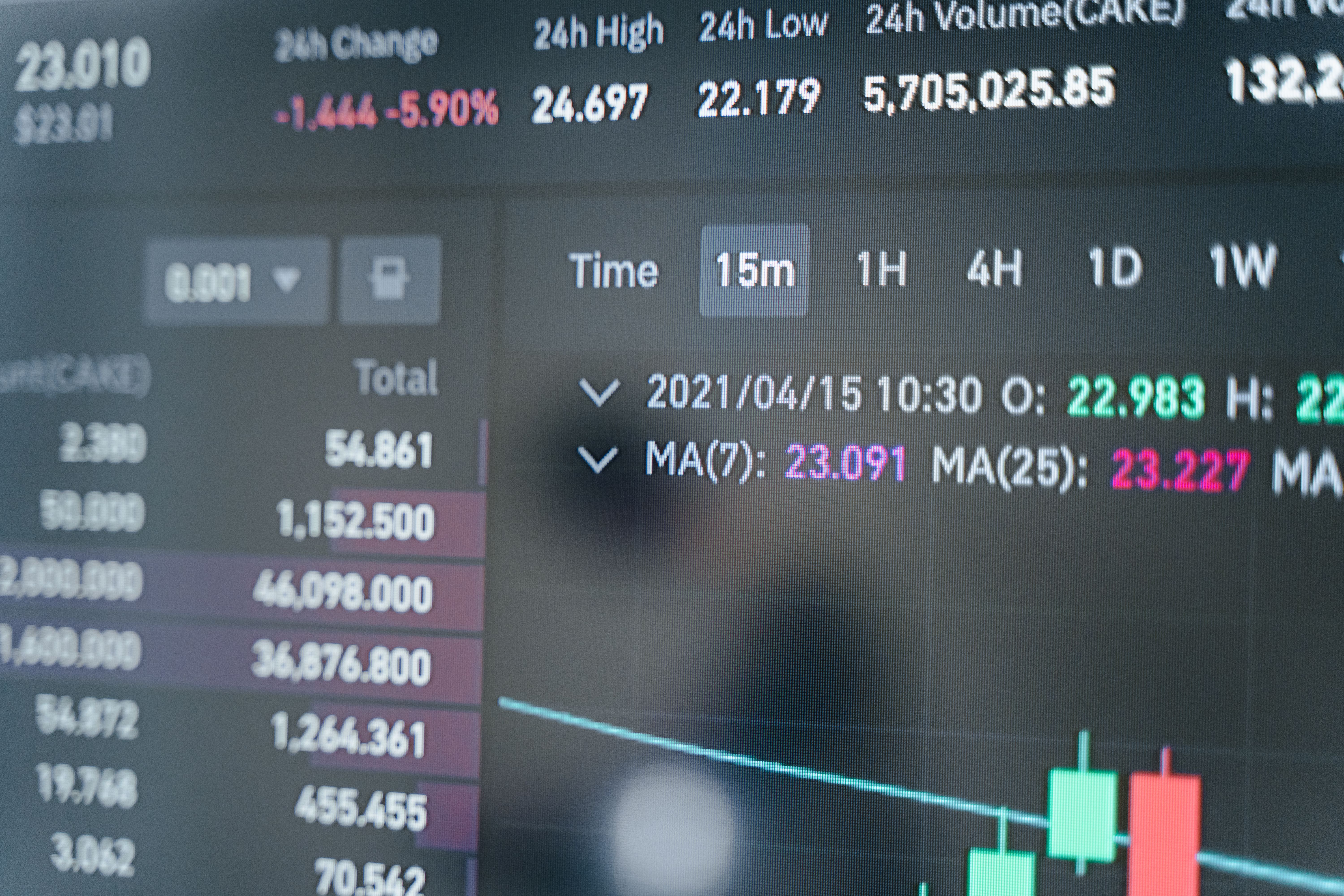
Market risk dashboards capture how market movements—such as interest rates, spreads, volatility, or FX shifts—affect trading activities and valuation exposures. These dashboards are often dynamic, updating daily or intra-day depending on the institution’s needs.
Typical dashboard components include sensitivities, value at risk (VaR), stress scenarios, limit utilizations, concentration markers, and product-level indicators. These visuals help users identify how market fluctuations influence P&L, understand which risk factors are most active, and assess whether exposures are aligned with stated risk appetite.
Market risk dashboards serve as early warning systems. When volatility spikes or correlations shift, dashboards help risk teams detect non-linear behaviors, unusual P&L swings, or sudden changes in sensitivities. This is especially relevant for pricing-dependent products such as derivatives, structured notes, or foreign-exchange instruments.
Dashboards also help risk functions communicate with trading desks and senior management. A well-designed dashboard presents information in a way that is accessible to both technical and non-technical audiences. It highlights what changed, why it matters, and what needs attention. This leads to more effective governance discussions and more timely escalation of issues.
Cross-functional benefits also arise:
- Treasury teams may use market dashboards to assess liquidity or funding sensitivity.
- Finance teams may connect market movements to P&L attribution or balance-sheet trends.
- Operational teams may reference dashboards to identify processing errors or data-quality concerns.
Ultimately, market risk dashboards strengthen transparency by offering both granular detail and aggregated views of market-driven exposures.
How Dashboards Support Liquidity Risk Functions
Liquidity risk dashboards help institutions understand how readily they can meet financial obligations during normal and stressed conditions. They often focus on funding sources, cash-flow profiles, client behaviors, asset encumbrance, and stress-test outputs.
These dashboards typically display forward-looking cash projections, liquidity coverage metrics, concentration risks, intraday movements, and indicators related to funding stability. They allow liquidity analysts and treasury teams to identify imbalances, anticipate short-term funding needs, and assess whether the institution maintains adequate liquidity buffers.
Liquidity dashboards support governance by illustrating which business lines are driving liquidity usage, which currencies or entities show stress, and how market developments influence funding dynamics. They also help identify operational or cash-processing issues that may affect forecast accuracy.
Dashboards also enrich cross-border and multi-currency oversight. Institutions with global operations may rely heavily on dashboards to compare liquidity conditions across regions, align their intercompany funding strategies, or monitor trapped liquidity. Visual tools help communicate these themes across senior management forums and regulatory settings.
When integrated with other risk dashboards, liquidity dashboards provide an enterprise-wide perspective on how market conditions, credit movements, operational events, or client behaviors collectively influence liquidity risk.
How Dashboards Support Operational Risk and Non-Financial Risk Functions
Operational and non-financial risk dashboards focus on control environments, incident patterns, process dependencies, technology resilience, and workforce-related themes. Instead of exposures and sensitivities, they highlight events, control gaps, issue remediation timelines, and thematic observations.
Typical dashboard elements include:
- Incident counts and severities
- Execution, delivery, or control failures
- Third-party and outsourcing risks
- Key risk indicators (KRIs) tied to specific processes
- Remediation timelines and overdue actions
- Emerging non-financial risks such as cyber threats or conduct concerns
These dashboards help institutions identify recurring themes across departments. For example, a spike in processing errors may indicate system instability or staffing challenges. A pattern of overdue remediation items may suggest governance bottlenecks or resource constraints.
Operational risk dashboards also support coordination with other functions:
- Technology teams may use dashboards to track system outages or capacity issues.
- Compliance may reference dashboards to identify potential regulatory exposures.
- Treasury and risk teams may consider how operational disruptions influence liquidity or credit reporting.
The value of these dashboards lies in their ability to highlight where controls may need strengthening, where incidents may signal broader risks, and where proactive mitigation is necessary.
How Dashboards Support Stress Testing and Scenario Interpretation
Stress-testing dashboards provide a structured view of how the institution may perform under adverse economic, market, or operational conditions. These dashboards consolidate model outputs, scenario assumptions, loss projections, capital impacts, and sensitivity overlays.
They enable governance bodies to understand potential vulnerabilities and assess how quickly risks may propagate across business lines. A stress-testing dashboard may illustrate how credit losses escalate under recession scenarios, how liquidity positions change under funding stress, or how market shocks affect valuation sensitivities.
These visuals help risk teams and senior leaders contextualize results, compare scenarios, and identify which portfolios or business lines drive the most significant variations. They also support oversight by highlighting areas where existing controls may be insufficient under stressed conditions.
Furthermore, stress dashboards reinforce transparency. They show where assumptions differ from baseline expectations, where model limitations may influence results, and which indicators warrant deeper analysis.
Integrated dashboards also support enterprise-level discussions by combining outputs from multiple risk stripes into a unified stress-testing narrative.
Cross-Risk Dashboards and Enterprise-Wide Integration
Institutions increasingly use integrated dashboards that combine credit, market, liquidity, and operational risk views. These dashboards support strategic decision-making by presenting interconnected risk themes.
Cross-risk dashboards allow stakeholders to see how one risk category influences another. For example:
- Market volatility may affect liquidity buffers.
- Operational outages may influence risk reporting timelines.
- Credit deterioration may influence funding spreads.
These dashboards enable institutions to interpret risk themes holistically and help leadership align decisions with overall risk appetite.
Designing Dashboards for Governance, Committees, and Senior Leadership
Dashboards support governance by creating standardized, repeatable reporting formats that align with regulatory expectations and internal oversight frameworks. Visual summaries help committees quickly absorb key insights, focus on deviations, and determine whether escalation or remediation is needed.
Effective dashboards generally include:
- Clear definitions and methodologies
- Transparent narratives explaining movements
- Structured views of limits, thresholds, and exceptions
- Trend analysis with forward-looking context
- Indicators that highlight where risk appetite may be pressure-tested
Dashboards that combine clarity, consistency, and interpretability offer the greatest value to governance bodies.
Conclusion
Risk dashboards are essential tools that support transparency, oversight, and decision-making across all risk functions. Each risk discipline—credit, market, liquidity, operational, non-financial, and enterprise-wide functions—depends on dashboards to summarize complex information in a way that users can interpret efficiently and accurately.
By translating data into structured analytical insights, dashboards help institutions navigate emerging risks, detect trends, and communicate effectively across teams. When designed well, they strengthen governance, improve collaboration, and enhance institutional stability.
This article is provided solely for informational and educational purposes. It does not describe any institution-specific processes, does not constitute professional or regulatory advice, and should not be interpreted as guidance on the management of internal governance or decision-making frameworks.
Stay Ahead
Access informational and educational resources. Subscribe to the Vault Newsletter for curated materials, learning frameworks, developmental tools, and early previews of upcoming releases.